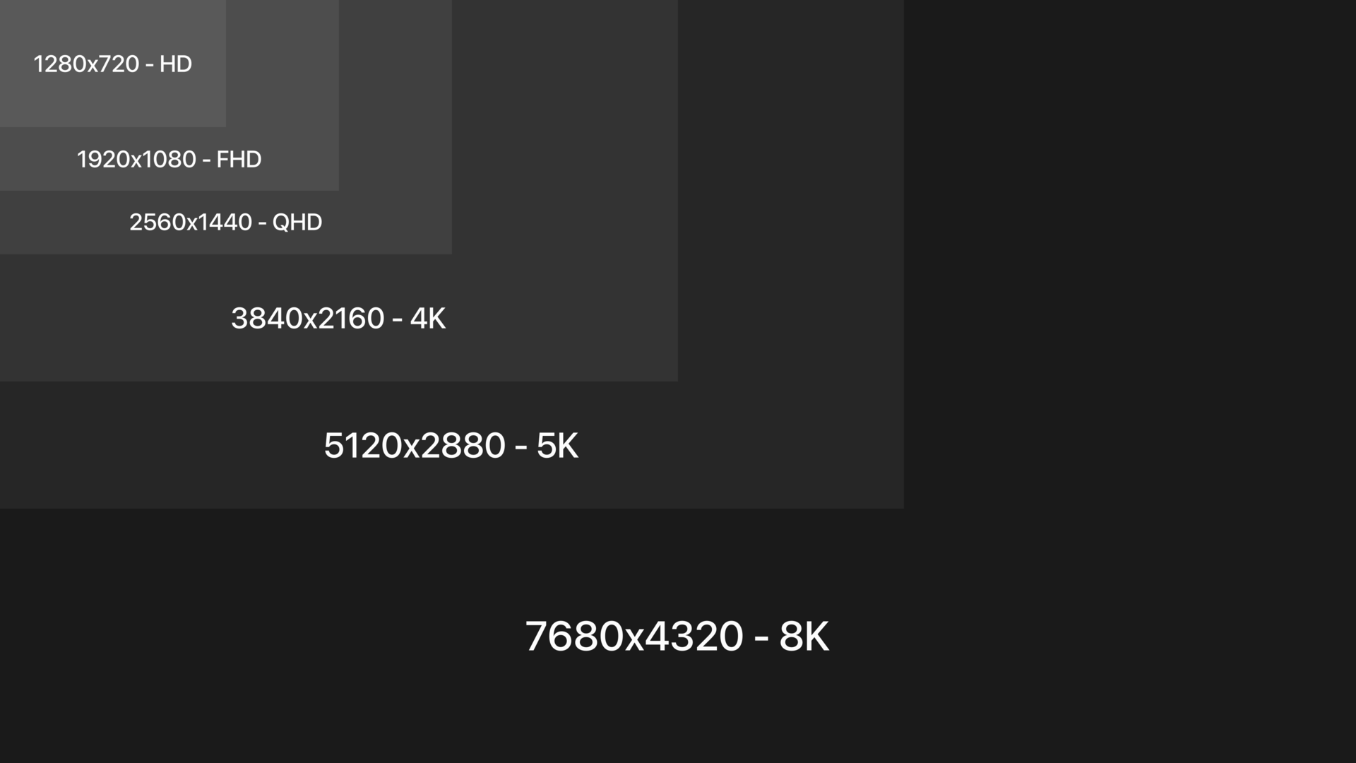
Choosing the “right resolution” for a Web image sounds straightforward until terms such as pixels, PPI, DPI, Retina, 2x, intrinsic dimensions, CSS pixels, and screen density start appearing together. These concepts are frequently mixed up, leading to two opposite mistakes: publishing files that are far larger than necessary or supplying images that are too small and therefore look blurry.
For the Web, the essential question is concrete:
How many source pixels does this image actually need to look sharp at the size at which it will be displayed?
The answer depends mainly on display width, screen density, and the role of the image. It depends far less on the famous “72 DPI” or “300 DPI” values still shown by many image applications.
If pixels, channels, alpha, and raster images are unfamiliar, begin with How Is a Digital Image Built?. It provides the foundation for understanding why resizing can dramatically reduce file weight without necessarily degrading the real visual result on a page.
Start with pixel dimensions
Raster image dimensions are normally written as:
width × height
Examples:
800 × 600 px;
1,200 × 800 px;
1,920 × 1,080 px;
4,032 × 3,024 px.
A 4,032 × 3,024 photograph contains a little more than 12 million pixels. A 1,200 × 800 image contains 960,000.
These dimensions are the first useful information when deciding whether a file is suitable for a Web use.
You can inspect them with the image metadata reader without uploading the image to a server.
A smartphone photograph may exceed 4,000 pixels in width even though the area where it appears on the site never exceeds 800 or 1,200 CSS pixels. Keeping the original dimensions in every case can mean encoding and transferring several times more pixels than necessary.
Resolution, definition, and density: why are the terms confusing?
In everyday language, “resolution” is often used to mean pixel dimensions. Technically, several different concepts are hidden behind that word.
Pixel dimensions
The pixel dimensions describe the number of pixels in the image: 1,920 × 1,080, for example.
This is usually the most important information when preparing a raster image for the Web.
Density
Density expresses a number of pixels or dots per physical unit. Common terms include:
PPI: pixels per inch;
DPI: dots per inch, especially associated with printing.
A high-density display packs more physical pixels into a given physical area.
Physical size
A printed image can be described in centimeters or inches. On the Web, an image is instead placed in a layout whose dimensions are mainly controlled through CSS.
These concepts can be related, but they are not interchangeable.
Why 72 DPI is not a Web rule
The claim that “Web images must be 72 DPI” is one of the most persistent image myths.
Consider two files containing exactly the same 1,200 × 800 pixel grid.
One has metadata saying 72 DPI. The other says 300 DPI.
If the browser displays both at width: 600px, they contain the same source pixel count and occupy the same CSS width. Changing only the DPI metadata has not created or removed a single pixel.
DPI can matter when software must translate digital dimensions into a physical print size, but it does not replace real pixel dimensions for Web display.
Changing a photograph from 72 to 300 DPI without resampling does not make it four times more detailed.
The image metadata reader can help distinguish metadata values from actual image dimensions.
Image pixels and CSS pixels are not always equivalent
Suppose an image is displayed with:
img { width: 600px;}
Those 600px are 600 CSS pixels. They do not necessarily mean that exactly 600 physical screen pixels are used.
On a standard-density display, the mapping may be close to one-to-one.
On a high-density display, the browser can use more physical pixels to represent the same CSS width. This is why an image that is only 600 source pixels wide may look less sharp when displayed at 600 CSS pixels on some dense screens.
This is where the device pixel ratio, or DPR, becomes useful.
Understanding device pixel ratio
devicePixelRatio approximately describes the relationship between physical device pixels and CSS pixels in the current display context.
A DPR of:
1 roughly corresponds to one physical pixel per CSS pixel;
2 can use about two physical pixels in each dimension for one CSS pixel;
3 can use still more.
A DPR of 2 does not mean twice as many pixels in total. It means approximately twice as many horizontally and vertically.
A 600 × 400 CSS-pixel area can therefore correspond approximately to:
DPR 1 → 600 × 400 = 240,000 pixels;
DPR 2 → 1,200 × 800 = 960,000 pixels;
DPR 3 → 1,800 × 1,200 = 2,160,000 pixels.
This is why interfaces sometimes refer to 1x, 2x, and 3x image assets.
It does not mean every visitor should always receive a 3x file.
A simple estimate for useful source dimensions
As a starting point:
useful source width ≈ maximum CSS width × target density
If an image is displayed at no more than 700 CSS pixels:
target 1x → around 700 px wide;
target 2x → around 1,400 px;
target 3x → around 2,100 px.
In many Web projects, a variant around 2x already provides an excellent compromise for dense displays.
This is not a universal rule. A complex photograph, thumbnail, decorative background, or technical diagram can justify different choices.
Why serving 3x everywhere can be wasteful
An image that is twice as wide and twice as high contains four times as many pixels.
Moving from 1,000 × 600 to 2,000 × 1,200 means moving from:
600,000 pixels to 2,400,000 pixels.
At 3x, 3,000 × 1,800 contains 5.4 million pixels.
Compressed size does not necessarily increase in exactly the same proportion, but more pixels generally mean more data to transfer, decode, and resize.
On a mobile connection, sending a 3x image when a smaller candidate would have been visually sufficient can slow the page for little perceptible benefit.
When dimensions change, the aspect ratio should normally remain unchanged.
A 1,600 × 900 image has a 16:9 ratio.
If you reduce it to 800 pixels wide:
900 × 800 / 1,600 = 450
The corresponding size is 800 × 450.
Changing it arbitrarily to 800 × 600 would distort the image.
When one dimension is known, use the aspect ratio calculator to find the matching dimension.
Resizing and cropping are different operations
These actions are often confused.
Resizing
Resizing changes the number of pixels while normally preserving the full framing.
A 2,000 × 1,000 image can become 1,000 × 500.
Cropping
Cropping removes part of the image.
A 2,000 × 1,000 image cropped to a square might become a 1,000 × 1,000 composition containing only part of the original scene.
This distinction becomes important in responsive design. Sometimes mobile needs a smaller version of the same composition; sometimes it needs a different crop.
The second case is art direction, not merely responsive resizing.
What does “native size” mean?
When an image is shown with one source pixel corresponding roughly to one CSS pixel, people sometimes describe it as being displayed at native or 1:1 size.
For example:
source: 1200 px widedisplay: 1200 CSS px
But this terminology becomes less straightforward on dense displays because CSS pixels and physical pixels differ.
For Web work, it is more useful to state explicitly:
intrinsic source width;
CSS display width;
DPR or density target.
Intrinsic dimensions
Browsers expose the natural dimensions of an image through properties such as:
img.naturalWidthimg.naturalHeight
These represent the intrinsic dimensions used by the browser for the decoded resource.
They are different from:
img.clientWidthimg.clientHeight
which relate to rendered layout dimensions.
This distinction helps diagnose oversized resources.
If naturalWidth is 4,000 while clientWidth is 400, the browser may be handling far more source pixels than the layout visibly needs.
CSS can resize without reducing the downloaded file
This is a critical performance point.
Consider:
<img src="photo-4000.jpg" alt="">
with:
img { width: 400px;}
The browser can visually display the image at 400 CSS pixels, but it may still have downloaded the 4,000-pixel file.
CSS resizing does not automatically optimize network transfer.
To reduce transferred data, provide appropriately sized resources.
Why responsive images matter
A layout can display the same image at:
320 CSS px on a phone;
640 CSS px on a tablet;
800 CSS px on desktop.
A single fixed source forces a compromise.
If you choose a 2,000-pixel file, small devices may download too much.
If you choose an 800-pixel file, large dense displays may lack detail.
HTML responsive image features allow you to provide several candidates and let the browser choose.
This communicates that both files correspond to the same CSS display size but target different pixel densities.
Use width and density strategies deliberately rather than mixing them without understanding the selection model.
How large should a hero image be?
There is no universal number.
Measure the maximum rendered width of the hero.
Suppose:
maximum CSS width: 1440 px
A high-quality strategy might provide candidates around:
640960128016002000
depending on layout and quality goals.
A full 2x 2,880-pixel candidate may or may not be worthwhile. Compare visual gain against transfer cost.
The right answer is based on the real design.
How large should an article image be?
If the article column never exceeds 760 CSS pixels, you do not need a 4,000-pixel source for every visitor.
A candidate set such as:
48080012001600
can cover a broad range of contexts.
The exact breakpoints should reflect your layout, not a generic list copied from another site.
How large should a thumbnail be?
A thumbnail displayed at 240 CSS pixels has different requirements from a hero.
Even on a 2x display, a source around 480 pixels may already be appropriate.
Sending a 2,000-pixel photograph for a 240-pixel card wastes bandwidth and decoding work.
Print changes the calculation
For print, physical dimensions become central.
Suppose you want to print an image 10 inches wide at 300 pixels per inch.
You need approximately:
10 × 300 = 3,000 pixels
of source width.
At 150 PPI:
10 × 150 = 1,500 pixels.
This is where pixel density values become directly useful.
DPI and PPI are not exactly the same
PPI refers to pixels per inch and is useful when relating digital image pixels to physical dimensions.
DPI literally refers to dots per inch and is historically associated with printer output.
In everyday software, the terms are often used loosely or interchangeably.
For practical image preparation, focus on the underlying question:
How many image pixels are available for the intended physical print size?
Calculating print size
If an image is 3,000 pixels wide and you target 300 PPI:
3,000 / 300 = 10 inches
At 150 PPI:
3,000 / 150 = 20 inches
The same file can therefore correspond to different physical sizes depending on the target density.
No pixels were created simply by changing the metadata value.
Changing DPI without resampling
Many image editors let you change a resolution field while keeping the same pixel dimensions.
Example:
before:3000 × 2000 px72 PPIafter:3000 × 2000 px300 PPI
If resampling is disabled, the pixel grid remains identical.
Only the implied physical print dimensions change.
This is why changing 72 to 300 does not improve a Web image.
Changing DPI with resampling
If the editor is allowed to resample while preserving a physical print size, changing the density can create or remove pixels.
That is a different operation.
Always check whether “resample” is enabled before interpreting a DPI change.
The crucial question is whether the actual pixel dimensions changed.
Upscaling and interpolation
When a source is too small, software can enlarge it by estimating new pixel values.
Traditional interpolation can make the enlargement smoother, but it cannot recover original detail that was never captured.
An image enlarged from 400 to 1,600 pixels wide may technically contain 1,600 pixels afterward, yet it does not suddenly contain the same genuine detail as a native 1,600-pixel capture.
AI upscaling
Modern machine-learning systems can infer plausible textures and details.
This can be useful in some creative workflows.
But inferred detail should not be confused with recovered historical information.
For documentation, evidence, scientific imagery, or faithful archival reproduction, that distinction can matter greatly.
For Web performance, the better strategy is usually to keep an adequate master source.
Downscaling
Reducing dimensions discards samples.
That sounds negative, but it is often exactly what Web delivery needs.
If a 4,000-pixel image will never be displayed above 1,000 CSS pixels, keeping every original pixel in the public derivative may provide no visible benefit.
Downscaling can dramatically reduce:
encoded file size;
decoding work;
memory usage.
It is one of the most useful image optimization steps.
Repeated resizing should be avoided
Do not build derivatives like this:
4000 → 2000 → 1200 → 800
if you still have the original.
Prefer:
4000 → 20004000 → 12004000 → 800
Each final variant is generated directly from the master.
This avoids accumulating resampling artifacts.
Resolution and compression solve different problems
Resizing reduces the number of pixels.
Compression reduces the amount of data needed to encode those pixels.
The same resolution reasoning applies to raster images loaded through CSS.
If a background fills a large hero area, you need enough source pixels for that area without blindly sending a huge file to every viewport.
CSS can also use image-set techniques in some scenarios, but content images often benefit from the richer semantics and responsive selection offered by <img> and <picture>.
Mobile-first does not mean “use the smallest image everywhere”
A mobile-first layout starts from smaller screens, but image delivery still has to account for:
actual display width;
DPR;
larger breakpoints;
art direction.
The goal is not to choose one tiny source.
The goal is to provide suitable candidates.
Do you need to target DPR 3?
Not always.
The perceptual benefit between 2x and 3x may be small for many photographic images, especially once compression, viewing distance, and display size are considered.
A 3x asset can also contain substantially more pixels.
Test the actual visual difference before making it a default requirement.
Browser zoom complicates the picture
Browser zoom can change the relationship between CSS pixels and device pixels.
That is another reason to let the browser select from a sensible responsive candidate set instead of trying to predict every device manually.
A practical workflow for Web images
1. Measure the layout
Determine the maximum CSS width of the image.
2. Decide which densities matter
For many uses, covering approximately 1x and 2x behavior is a good starting point.
Compare JPEG, PNG, WebP, and AVIF according to content.
7. Compress appropriately
Do not keep unnecessarily high quality settings.
8. Declare responsive candidates
Use srcset and sizes where appropriate.
9. Test
Inspect which file the browser actually downloads.
Example: blog photograph
Suppose:
original: 4032 × 3024article column: max 760 CSS px
You might generate:
480 × 360800 × 6001200 × 9001600 × 1200
Then let the browser select among them.
The original remains archived but is not automatically delivered to visitors.
Example: 64-pixel avatar
The rendered size is fixed:
64 × 64 CSS px
You might provide:
64 × 64 → 1x128 × 128 → 2x
There is little reason to serve a 2,000-pixel portrait for that slot.
Example: full-width hero
Suppose the hero can reach 1,600 CSS pixels.
You may need a broader candidate range, but still should not assume every phone needs the largest file.
Responsive selection is especially valuable here.
Example: print flyer
Suppose a photograph must be printed 6 inches wide at 300 PPI.
Target source width:
6 × 300 = 1,800 pixels.
Here physical size and pixel density directly determine the required pixel count.
This is a different problem from Web layout.
Common mistakes
Treating 72 DPI as a Web requirement
It is not.
Looking only at file size
A light file can still be vastly oversized in dimensions.
Looking only at dimensions
A correctly sized image can still be inefficiently encoded.
Serving the camera original everywhere
Most Web display slots do not need it.
Resizing through CSS only
CSS changes display size, not necessarily downloaded bytes.
Stretching width and height independently
This distorts the image.
Always targeting 3x
The transfer cost may exceed the visual benefit.
Generating variants from variants
Use the master whenever possible.
Confusing crop with resize
They solve different visual problems.
Assuming a 300-DPI metadata field adds detail
It does not create pixels.
A compact decision table
Use
Start by checking
Article image
Maximum content-column width
Hero image
Maximum viewport/container width
Thumbnail
Actual card dimensions
Avatar
Fixed CSS size and density target
Print
Physical size and target PPI
Responsive image
Layout width plus candidate selection
SVG
Vector geometry rather than raster pixel count
What to remember
For Web images, begin with actual pixel dimensions and actual display size.
DPI metadata does not make a Web image sharper by itself.
High-density screens can benefit from more source pixels than the CSS display width, but sending the maximum possible density to everyone wastes data.
Preserve aspect ratio, keep a large master, generate appropriate derivatives, and let responsive image mechanisms choose among them when the layout varies.
Then balance those dimensions with format and compression.
Frequently asked questions
What is image resolution?
The term is used loosely. For Web work, pixel dimensions are usually the most important starting point, while density becomes important when relating CSS or physical size to source pixels.
Is 72 DPI required for Web images?
No. A browser primarily works with pixel dimensions and layout, not a universal 72-DPI rule.
Is 300 DPI better for the Web?
Not by itself. Changing only DPI metadata does not create additional source pixels.
What is PPI?
Pixels per inch, a density measure useful when relating digital pixels to physical size.
What is DPI?
Dots per inch, historically associated with printing. Software sometimes uses the term loosely where PPI would be more precise.
What is device pixel ratio?
It describes the relationship between CSS pixels and physical device pixels in the current display context.
What does 2x mean?
It generally means an asset has about twice as many source pixels in each dimension as the CSS slot it targets.
Does 2x mean twice as many pixels total?
No. Doubling both width and height produces four times as many pixels.
Should every image have a 3x version?
No. Test whether the extra detail is perceptible enough to justify the extra data.