Web image optimization is not a single conversion or compression setting. It is a pipeline that begins with the role of the image and ends with what the browser actually downloads, decodes, and renders.
This final article in the collection connects the previous topics: pixels, resolution, color, accessibility, formats, compression, SVG, responsive images, and metadata. The objective is to reduce waste without sacrificing useful visual quality, accessibility, privacy, or maintainability.
There is no magic Optimize button
Image performance is a system. A modern codec cannot compensate for huge dimensions; aggressive compression cannot fix incorrect sizes; lazy loading cannot help a hero that must appear immediately. Optimize the complete path from master source to rendered page.
The global pipeline
Understand the image’s role → inspect the source → determine required dimensions → choose format → resize → compress → generate responsive variants → manage metadata → declare dimensions → choose loading priority → cache → measure in the real page.
Step 1 — Understand the role
Classify the asset: LCP hero, article image, card thumbnail, avatar, logo, decorative background, gallery image, product photograph, or user upload. Role determines quality, dimensions, priority, accessibility, and caching decisions.
Step 2 — Understand the source
Inspect intrinsic dimensions, format, transparency, color profile, metadata, and whether the asset is raster or vector. See How Is a Digital Image Built? for the fundamentals.
Step 3 — Determine the dimensions actually needed
Measure the largest real rendered slot and consider useful device pixel densities. Do not publish a 6000px camera original into a 700px article column. Resizing is often the largest single saving.
Do not resize from an already reduced derivative
Generate each required width from the best master available. Upscaling a thumbnail or repeatedly resizing lossy files compounds quality loss.
Preserve aspect ratio
Unless art direction requires cropping, keep the source ratio. Distorting width and height independently produces stretched images. For deliberate crops, generate separate compositions.
Step 4 — Choose the right format
Photographs often suit JPEG, WebP, or AVIF; screenshots may suit PNG or lossless WebP; logos and icons may belong in SVG. Read PNG, JPEG, WebP, or AVIF.
JPEG
JPEG remains a valid choice when compatibility, tooling, and photographic quality are good. Do not convert a well-optimized JPEG merely to obtain a newer extension if the practical gain is negligible.
WebP
WebP is a versatile modern option with lossy, lossless, transparency, and animation capabilities. It is often a pragmatic default candidate for Web raster delivery.
AVIF
AVIF can deliver excellent photographic compression, but encoding cost, quality tuning, tooling, and actual content matter. Test it rather than assuming it always wins.
PNG
PNG remains valuable for lossless screenshots, flat graphics, and transparency. It is often inefficient for photographs, where lossy codecs can save far more.
SVG
Use SVG for genuinely vector logos, icons, diagrams, and geometric illustrations. Optimize the markup with the SVG optimizer and see SVG Optimization.
Step 5 — Convert only when it helps
Every conversion adds files and pipeline complexity. Compare the new derivative at equivalent visual quality. Keep it only if the size, compatibility, or workflow benefit is meaningful.
Step 6 — Compress intelligently
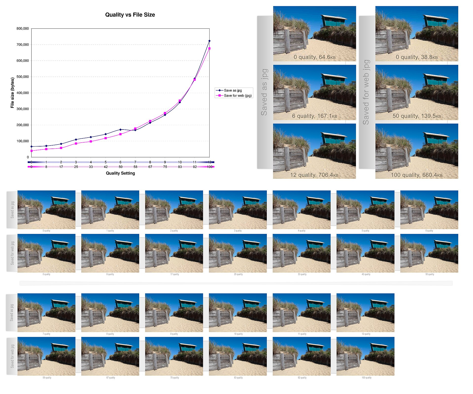
Start from high quality and reduce progressively while inspecting the final display size. There is no universal quality setting. See Image Compression.
Judge quality at usage size
Zoom is useful for diagnosing artifacts, but the decision belongs at the rendered size. A tiny defect visible at 800% may be irrelevant; blurred text in a documentation screenshot is not.
Step 7 — Generate multiple sizes when necessary
Fluid layouts should not force every device to download the largest candidate. Generate a reasonable width ladder and use srcset/sizes. Read Responsive Images.
A responsive image is more than max-width: 100%
CSS can make one large resource fit every screen, but responsive resource selection changes which file is downloaded.
Choose reasonable width steps
Base variants on actual layout slots and density needs. Too few creates wasteful gaps; too many increases build, storage, and cache complexity.
Step 8 — Manage delivery metadata
Public derivatives rarely need every EXIF or editor field. Remove sensitive GPS and unnecessary workflow data while preserving required rights and color information. See Image Metadata and Privacy.
Keep priorities straight
Removing 15 KB of metadata from a 4 MB oversized photograph is not the main optimization. Fix dimensions and encoding first, then clean metadata.
Step 9 — Declare width and height
Intrinsic dimensions let the browser reserve layout space before the image loads, reducing unexpected shifts. CSS can still scale the image responsively.
Why visual stability matters
A page that jumps while images load is harder to read and interact with. Image dimensions contribute to Cumulative Layout Shift prevention.
aspect-ratio and object-fit
CSS aspect-ratio can reserve predictable space. object-fit controls how an image fills a box, but it does not reduce the downloaded pixels or replace art-directed crops.
Step 10 — Decide when to load
Below-the-fold content can often use loading="lazy". Critical above-the-fold images, especially the LCP hero, should usually be discoverable and requested early.
Do not lazy-load the main image mechanically
Lazy loading an LCP candidate can delay the moment the browser starts fetching it. Use loading strategies according to role, not as a blanket rule.
loading="eager" and fetchpriority
Eager loading can be appropriate for critical images. fetchpriority="high" can help signal an important hero, but using high priority everywhere destroys the signal and competes for bandwidth.
LCP and the hero image
If the hero is the LCP element, optimize its dimensions, format, responsive selection, discovery, and priority together. A 50 KB saving may matter less than discovering the request 500 ms earlier.
Make the LCP image discoverable
Prefer straightforward HTML when possible. Images hidden behind late JavaScript or CSS discovery can start too late. Preloading can help in specific cases but should match the actual responsive candidate logic.
CSS background or <img>?
Use <img> for meaningful content images because it supports alt, intrinsic dimensions, responsive candidates, and browser image behavior directly. CSS backgrounds are better suited to decoration.
Decorative images
Ask whether the image should exist at all. CSS gradients, colors, or simple SVG can sometimes replace heavy decorative raster assets.
Step 11 — Decode without unnecessary blocking
decoding="async" can allow decoding to happen without blocking other presentation work in some cases. Treat it as a hint, not a substitute for reducing image complexity.
Compressed size vs decoded memory
A 200 KB JPEG can decode into tens of megabytes of pixel memory. Large dimensions therefore affect memory and rendering even when network compression looks good.
Step 12 — Preload selectively
Preload only truly critical resources. Preloading the wrong candidate can cause duplicate or unnecessary transfers, especially with responsive images.
Step 13 — Use caching
Long-lived immutable image URLs can be cached effectively. If content changes, hashed filenames or versioned URLs make cache invalidation predictable.
Step 14 — CDN and transformations
Image CDNs can resize, convert, and compress on demand. Static builds can do the same ahead of time. Choose according to scale, cost, control, latency, and operational needs.
Automate without losing control
A pipeline can enforce width ladders, formats, metadata rules, and budgets. Preserve masters and allow exceptions when automated settings visibly damage an asset.
Image and page budgets
Set role-aware image budgets and a page-level total. Ten individually acceptable images can still create a heavy page. Budgets should trigger review rather than encourage visible degradation.
Request count
Modern HTTP reduces some cost of many requests, but each image still consumes bandwidth, decode work, memory, and rendering time. Avoid decorative proliferation.
SVG sprites
For large icon systems, sprites or component reuse can reduce duplication. For a small site, individual optimized SVGs may be simpler. Measure maintenance as well as bytes.
Step 15 — Measure in the real page
Use the browser Network panel, currentSrc, rendered dimensions, and performance traces. Test deployed URLs, not only files on disk.
Do not test only on fast fiber
Throttle network and CPU, test mobile devices, and consider cold-cache visitors. A page that feels instant on a developer workstation can be slow on ordinary hardware.
Lighthouse and synthetic tools
Synthetic audits are excellent for diagnostics and repeatability, but they model particular conditions. Use them to find problems, then verify with field data and real-user behavior where available.
Field data
Real-user metrics reveal device, network, cache, and interaction diversity. They can show whether an optimization improves actual LCP or merely changes a laboratory score.
Core Web Vitals are not the only objective
Optimize for a useful, stable, readable page. Do not destroy image quality or accessibility merely to chase a score. Performance is one dimension of user experience.
Diagnosing LCP
Identify the actual LCP element, request start time, transfer duration, and render delay. If the image is small but discovered late, compression is not the primary problem.
Diagnosing CLS
Check missing dimensions, late aspect-ratio changes, dynamically inserted media, and fonts or components around the image. Image compression does not solve layout instability.
Text inside images
Avoid essential text baked into images when HTML can express it. If text must be part of an image, preserve sharpness and contrast and provide an accessible equivalent.
Transparency and dark mode
Transparent assets must be tested on every intended surface. A white logo can disappear in light mode; dark edge halos can appear on dark backgrounds after poor alpha processing.
Accessibility
Use meaningful alt for informative images, empty alt for appropriate decoration, sufficient contrast, and non-color cues. Complex charts may need textual summaries or data tables.
SEO
Useful images can support content quality when they are crawlable, fast, semantically integrated, and accompanied by relevant text. Image optimization is not a keyword trick.
Complete hero example
Start from the master, crop intentionally if needed, generate several widths, encode efficient formats, declare srcset and accurate sizes, set dimensions, avoid lazy loading, consider high fetch priority, and measure LCP on a cold mobile profile.
Article image example
Limit variants to the article column’s real maximum width plus useful high-density needs. Lazy-load images well below the fold and keep sizes aligned with the content container.
Card thumbnail
Small slots benefit enormously from correct dimensions. Do not serve the same 1600px image used by the article hero into a 280px card.
Avatar
Fixed-size avatars can use simple density variants. Crop once from the master, compress appropriately, and cache aggressively when identity images rarely change.
Logo
Prefer optimized SVG for vector logos. Preserve the viewBox, accessible naming strategy, and brand colors. Avoid rasterizing solely for convenience.
Gallery and lightbox
Thumbnails and full-view images have different roles. Load small grid candidates first and fetch larger lightbox resources only when needed.
E-commerce
Product images often need several zoom levels and angles. Preserve color accuracy, generate responsive sizes, lazy-load noncritical gallery items, and ensure zoom resources are not downloaded before interaction.
Blog
Article covers and inline images are common performance hotspots. Standardize dimensions, formats, metadata policy, and responsive markup in the publishing pipeline.
Photo portfolio
Visual quality may justify larger files than on a documentation site. Optimize dimensions and delivery first, then choose compression settings that respect the portfolio’s purpose.
Institutional site
Consistency and maintainability matter. Define reusable image roles, enforce accessible alternatives, keep rights metadata/documentation, and automate common derivatives.
User-generated images
Never trust dimensions, metadata, format claims, or SVG markup. Validate uploads, limit resource consumption, normalize orientation, create safe derivatives, and sanitize active formats.
Common mistake: optimizing only compression
A 4000px AVIF can still be wasteful in a 400px slot. Dimensions, selection, and loading often matter more than squeezing another few percent from the codec.
Common mistake: converting everything to AVIF
Some screenshots, logos, or tiny graphics gain little. Operational complexity can outweigh savings. Choose by content and measurement.
Common mistake: sizes="100vw" everywhere
Contained images and grid cards then look much larger to the browser than they really are, leading to oversized candidate selection.
Common mistake: lazy loading everything
This can delay LCP and other important above-the-fold content. Use lazy loading according to visibility and role.
Common mistake: high priority everywhere
Priority hints only work when important resources are distinguished from ordinary ones. Too many high-priority images compete with each other.
Common mistake: forgetting dimensions
Even a tiny, fast image can cause layout shift if the browser cannot reserve its space.
Common mistake: preloading the wrong variant
Responsive images complicate preloading. If the preload URL differs from what the browser later selects, you can pay for two resources.
Common mistake: measuring only disk size
Network transfer can be affected by caching and compression, while decode memory depends on pixel dimensions. Inspect the full lifecycle.
Common mistake: destroying quality for a few kilobytes
Performance is not a contest for the smallest file. Stop when further savings create visible artifacts or undermine the content.
Common mistake: serving originals publicly
Originals may contain huge dimensions, sensitive metadata, and unnecessary quality. Keep them in source storage and publish derivatives.
Common mistake: deleting originals after optimization
Future layouts and codecs need a clean master. Delivery files are disposable outputs.
Common mistake: forgetting credits
Optimization and metadata cleaning must not erase legal attribution requirements. Keep rights records and display credits where required.
Common mistake: trusting one Lighthouse score
A score is a diagnostic snapshot under modeled conditions. Investigate the underlying requests and real-user metrics.
Common mistake: optimizing an image that should not exist
Sometimes the best optimization is deleting a decorative image, replacing it with CSS, or simplifying a complex illustration.
Priority order for an existing site
Start with the heaviest above-the-fold images and LCP assets. Fix obviously oversized dimensions, then responsive selection, formats/compression, loading priority, metadata, and long-tail decorative assets.
Quick page audit
List every image request with URL, transferred bytes, intrinsic dimensions, rendered dimensions, currentSrc, loading behavior, and whether it is visible above the fold. The biggest mismatches become your first targets.
Audit one image
Ask: Is it needed? Is it raster or vector? Are dimensions appropriate? Is the format suitable? Is compression acceptable? Is metadata intentional? Is responsive selection correct? Is loading priority correct? Is accessibility complete?
A 5000px photograph may first shrink dramatically by resizing to the largest useful width. A modern format and tuned quality can then reduce it further. Responsive variants prevent smaller screens from receiving even that largest derivative.
Example: failed optimization
Converting a huge PNG photograph to AVIF while keeping its 6000px dimensions may improve bytes but still wastes decode memory and transfer. The pipeline fixed the codec and ignored the geometry.
Example: excessive optimization
A hero reduced until skin, gradients, or text visibly break has crossed the useful threshold. Restore quality and seek savings through dimensions, responsive selection, caching, or noncritical assets.
Master preserved; role defined; dimensions measured; format tested; quality inspected; responsive variants generated; metadata policy applied; width/height declared; alt correct; loading/priority chosen; cache configured; Network and currentSrc verified.
Monthly audit checklist
Review the largest image requests, LCP pages, new content templates, unexpected originals, cache misses, broken variants, metadata regressions, and changes in real-user performance.
Automated tests
CI can validate maximum dimensions, file budgets, allowed formats, required alt in components, srcset consistency, SVG safety rules, and missing width/height attributes. Visual tests can catch compression or SVG regressions.
Observability and maintenance
Image performance drifts as editors add content and layouts change. Keep metrics, budgets, and periodic audits. A pipeline is successful when it remains effective six months later without heroic manual cleanup.
Performance and sustainability
Transferring fewer unnecessary bytes reduces network and processing work. The largest gains come from avoiding waste, not from degrading every image to the edge of acceptability.
Optimization is a system
The best format, quality, number of variants, and loading strategy are all contextual. What remains stable is the method: understand the role, preserve the master, generate appropriate derivatives, integrate them correctly, and measure the result.
A practical order of operations when time is limited
If you can only spend an hour improving a page, begin with the Network panel and identify the largest visible image requests. Compare intrinsic and rendered dimensions. Fix any extreme mismatch first, because serving a 4000px source into a 400px slot is usually a larger problem than codec fine-tuning.
Next identify the LCP element. If it is an image, verify that it is discovered early, not lazy-loaded, and selected through accurate responsive markup. Then inspect below-the-fold images for lazy loading and oversized candidates.
Only after these structural issues are under control should you spend time comparing small quality adjustments or shaving metadata. This priority order prevents teams from optimizing the easiest number instead of the biggest user-facing problem.
Document the image system
Record standard roles, maximum dimensions, preferred formats, quality ranges, responsive width ladders, metadata policy, loading rules, and exceptions. Editors should know which source to upload; developers should know which component to use; the build should generate predictable derivatives.
Good documentation turns image optimization from a one-time performance sprint into ordinary publishing hygiene. When the design changes, update the documented slot sizes and regenerate derivatives rather than accumulating ad-hoc fixes.
What to remember
Start with necessity and dimensions, then choose format and compression. Generate responsive candidates, manage metadata, reserve layout space, load critical images early and noncritical images later, cache effectively, and measure in the real page.
Frequently asked questions
What is the first thing to optimize? Usually unnecessary dimensions and the heaviest critical images.
Should every image be AVIF? No.
Should every below-fold image be lazy-loaded? Often, but test the page.
Should the LCP hero be lazy-loaded? Usually no.
Is file size enough to judge performance? No; discovery, dimensions, decode, caching, and rendering matter.
How many responsive widths? Enough to cover real slots without creating needless variants.