Light gray text on white may look elegant in a mockup and become exhausting to read on a phone outdoors. A form field whose border almost disappears can be difficult to identify, and a status that changes only from red to green may not be understandable to everyone.
Contrast is therefore not merely an aesthetic preference. It is part of visual accessibility. The Web Content Accessibility Guidelines (WCAG) provide measurable criteria for text, interface components, and meaningful graphics. They do not impose a universal palette or require black-and-white websites; they set minimum conditions so information remains perceivable.
This guide explains the main thresholds, the reasoning behind them, and the limits of a simple “AA/AAA” badge. If you need a refresher on color notation first, read RGB, HEX, or HSL: Which Color Notation Should You Use?. If you are building colors from an image, see How to Create a Color Palette From an Image. For direct testing, use the contrast checker.
WCAG contrast in one minute
For normal text, WCAG 2.x level AA uses a minimum contrast ratio of 4.5:1. Large text can use 3:1. Level AAA raises those targets to 7:1 for normal text and 4.5:1 for large text. Meaningful non-text interface components and graphical objects generally use a 3:1 requirement against adjacent colors. These numbers apply to specific uses, not to a color in isolation.
What is a contrast ratio?
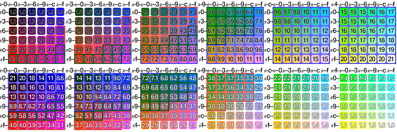
A contrast ratio compares the relative luminance of two colors. The scale runs from 1:1, where both colors have the same luminance, to 21:1, the theoretical maximum between black and white. A higher number means a stronger luminance difference, but it does not say whether a palette is attractive, whether color is used semantically, or whether the whole interface is accessible.
Why can’t HSL lightness tell you the contrast?
HSL lightness is convenient for editing colors, but it is not WCAG relative luminance. Two colors can both have L: 50% and still appear very different in brightness. Human vision is not equally sensitive to red, green, and blue. Use real RGB/sRGB values in a contrast algorithm rather than guessing from HSL.
How is the ratio calculated?
WCAG contrast calculations convert encoded sRGB channel values into linearized values, combine them into relative luminance, then compare the lighter and darker colors using (L1 + 0.05) / (L2 + 0.05). You do not need to calculate this manually: the contrast checker exists precisely to avoid arithmetic and transcription errors.
What does 4.5:1 actually mean?
It means the luminance relationship between the two tested colors reaches the AA threshold for normal text under the relevant WCAG criterion. It does not mean that every user will find the text equally easy to read, that the font is large enough, or that the component is accessible in every state.
What counts as large text?
In WCAG 2.x guidance, large-scale text is approximately 18 pt regular or 14 pt bold, with equivalent CSS-size interpretation depending on the context. Do not label text “large” merely because it looks prominent in a design tool. Weight and actual rendered size matter.
AA and AAA: what is the difference?
AA is the usual conformance target for many sites and products. AAA is more demanding. For contrast, AAA increases the margin for text, but a site cannot become universally accessible simply by pushing every color pair to AAA. Accessibility includes structure, keyboard use, alternatives, semantics, motion, forms, and much more.
Should you always aim for AAA?
Not for every visual element at any cost. AAA can be an excellent objective for body text and critical content, but forcing every brand accent into AAA combinations may be unnecessary or counterproductive. A sensible approach is to meet the required criterion and keep a comfortable margin where the design allows it.
Is black on white always the best solution?
It gives maximum contrast, but maximum contrast is not automatically the most comfortable visual treatment for every interface. Very strong contrast can feel harsh for some users and contexts. The goal is sufficient, robust contrast—not mechanically turning every page into pure black on pure white.
Is a color accessible by itself?
No. Accessibility is contextual. #2563eb may work perfectly as text on white and fail on a dark blue background. The same color may be suitable for a large icon but not for small body text. Always test a foreground/background pair in a defined role.
How do you test a text color?
Identify the actual foreground and background colors, including opacity and overlays. Test the pair with the contrast checker, then inspect the real component at its final font size and weight. Repeat the test for hover, focus, active, disabled, visited, error, and dark-mode states where relevant.
Why does transparency complicate contrast?
A semi-transparent foreground does not have one final color. It is composited with whatever lies behind it. rgb(0 0 0 / 50%) produces different visible colors over white, gray, or a photograph. Calculate or sample the composited result, not only the source color with alpha.
Text on an image: why isn’t one test enough?
A photograph contains many local backgrounds. White text can have excellent contrast over a dark area and fail a few pixels away over a bright cloud. Test the weakest relevant region, or create a stable background with an overlay, gradient, solid panel, text shadow used carefully, or a redesigned crop.
Are images of text covered?
WCAG generally discourages using images of text when the same visual presentation can be achieved with real text, with limited exceptions. Real HTML text scales, adapts, can be selected and translated, and usually provides better accessibility. If text is embedded in an essential image, its contrast still matters.
Do logos have to meet 4.5:1?
Logotypes and brand names have specific exceptions under the text-contrast criterion. That does not mean a nearly invisible logo is good design. If the logo also communicates an actionable control or essential state, other accessibility considerations can apply.
What about placeholders?
Placeholder text is often made too pale. If it communicates useful information, it still needs to be readable. More importantly, a placeholder should not replace a persistent label: once the user types, the placeholder disappears. Keep labels visible and treat placeholder text as secondary assistance.
Button text is evaluated as text and therefore follows the relevant text threshold. The visual boundary or state of a component can fall under non-text contrast requirements. A filled button may be distinguishable from its surroundings without a border, but its label still needs sufficient contrast against the button background.
What is non-text contrast?
WCAG 1.4.11 addresses visual information needed to identify user-interface components and meaningful graphics. A 3:1 contrast ratio is commonly required against adjacent colors. Think of input boundaries, focus indicators, essential icons, chart lines, and controls whose shape must remain perceivable.
Does every icon always need 3:1?
No. Decorative icons that convey no information can be treated differently. If an icon is the only visible representation of a control or communicates essential information, its visibility matters. Determine its function first, then apply the relevant criterion.
Do charts need contrast?
Meaningful lines, bars, points, and regions should remain distinguishable. But contrast alone is not enough. Do not rely solely on hue to distinguish series: add labels, patterns, markers, line styles, or direct annotations where useful.
No. WCAG’s use-of-color criterion requires another visual or textual cue when color conveys information. An error should not be indicated only by turning a border red; add an icon, message, label, or other persistent cue.
Should red and green never be used together?
They are not forbidden. The problem is using red-versus-green hue as the only distinction. You can combine them with text labels, icons, shapes, patterns, or different luminance levels so the meaning survives when hue differences are difficult to perceive.
Keep the field label, identify the error in text, associate the message programmatically with the field, and provide a visible cue that is not color alone. Ensure the error text and meaningful border/icon have sufficient contrast. Also make sure focus moves and announcements behave appropriately when validation occurs.
Is keyboard focus only a contrast issue?
No. The indicator must exist, be visible, have suitable geometry and persistence, and appear at the right time. Contrast is one part of a usable focus style. Avoid removing the browser outline unless you replace it with an equally or more visible indicator.
Is hover enough to show interactivity?
No. Touch users do not have hover, and keyboard users rely on focus. Links and controls should remain identifiable without requiring a mouse hover state. Provide appropriate semantics and visible focus styles.
Are disabled elements subject to the same requirements?
Inactive controls have exceptions in some WCAG contrast criteria. That does not mean they should become impossible to recognize. Users still benefit from understanding that a control exists and is unavailable. Use the exception carefully rather than making disabled UI vanish.
Why ‘everyone uses this gray’ is not a justification
Popularity does not change the measured contrast. A fashionable light gray can still fail. Test your actual foreground and background instead of assuming a common design convention is automatically compliant.
How do you fix a color that barely fails?
Adjust the foreground, background, or both until the pair has a comfortable margin. Often a slightly darker text color on a light surface is enough. Preserve the intended visual hierarchy, but do not optimize to the exact last decimal: real interfaces include opacity, rendering, states, and future changes.
Why not change only HSL lightness?
Because HSL lightness is not perceptual luminance. It can be a convenient editing control, but verify the resulting pair after every change. The color converter can help explore representations; the contrast checker should make the final decision.
How do you integrate contrast into a design system?
Define semantic tokens for text, surfaces, borders, controls, and states. Document approved combinations rather than publishing isolated swatches. Automated tests can protect critical token pairs, while component review catches cases involving images, transparency, gradients, and state changes.
Do you need to test every palette color against every other color?
Usually no. Test combinations that can actually occur. A ten-color palette creates many theoretical pairs that may never be used. Focus on semantic relationships: primary text on each surface, links, buttons, badges, borders, focus, alerts, charts, and dark-mode equivalents.
Example: secondary text on white
A designer may choose a light gray to make metadata visually secondary. If it fails 4.5:1 at the rendered size, darken it rather than shrinking the font or accepting the failure. Visual hierarchy can be created with spacing, weight, size, and placement—not only weak contrast.
Test the button label against the fill, then verify the component boundary or state where necessary. Repeat for hover, active, focus, and disabled states. A beautiful default state does not compensate for an invisible keyboard focus ring.
Example: status badge
Do not communicate success, warning, and error only through green, orange, and red. Add text such as “Success,” “Warning,” or “Error,” or use meaningful icons. Then test text and graphical contrast inside each badge.
Example: text on a photograph
Find the brightest and darkest areas behind the text. If the image varies too much, add a controlled overlay or place the text in a solid container. Responsive crops must also be tested because mobile may put the same text over a completely different region.
Example: chart with several series
Use color plus another differentiator: markers, dash patterns, direct labels, or shapes. Test each meaningful series against the chart background and make legends understandable without requiring users to distinguish subtle hue differences.
How can you audit a page quickly?
Start with body text, muted text, links, buttons, inputs, focus indicators, alerts, and charts. Use automated tooling to find obvious failures, then manually inspect images, gradients, transparency, state changes, and responsive variants. Automation is a filter, not a complete accessibility audit.
Why must dark mode be tested separately?
A color pair that works on a white surface may fail or become visually aggressive on a dark one. Dark themes often require new surface and text tokens rather than simple inversion. Test every semantic combination again.
An eyedropper is useful for inspecting the final rendered pixel, especially with transparency or images, but it can sample antialiased edge pixels or a nonrepresentative location. Prefer source colors when they are known and use sampling to validate complex compositing.
Why can antialiasing mislead screenshots?
Text edges contain blended pixels created by rasterization. Sampling those edge pixels may produce a lighter or darker value than the declared text color. WCAG contrast calculations normally use the specified foreground and background colors, not an arbitrary antialiased screenshot pixel.
Contrast and font size: common mistakes
Do not classify text as large based on a design label such as “heading.” Check actual size and weight. Do not assume bold automatically solves contrast. And remember that passing 3:1 for large text does not make the same color suitable for smaller text.
Why aim for margin instead of the exact threshold?
A token at exactly 4.50:1 can become noncompliant after a tiny color adjustment, opacity change, theme modification, or rounding difference. A reasonable margin makes the design more robust and usually costs little.
Is contrast enough to make an interface accessible?
No. Contrast addresses only part of visual accessibility. Semantics, keyboard navigation, focus order, labels, alternatives, zoom, reflow, motion, language, error handling, and assistive-technology support all matter.
Changing JPEG to WebP or AVIF does not automatically change intended colors, but aggressive lossy encoding can alter local pixels. For text baked into images or charts, inspect the final encoded asset. See PNG, JPEG, WebP, or AVIF.
Contrast and image compression
Compression artifacts can blur small text, edges, or chart lines even when nominal colors would pass. Accessibility therefore depends on the final visual asset, not only its source design. See How to Compress an Image Without Unnecessary Quality Loss.
Contrast and SVG
SVG is often ideal for icons and diagrams because geometry stays sharp and colors can remain explicit. Inline SVG can also use currentColor, making it easier to inherit accessible theme tokens. See SVG: Understanding the Vector Format.
An accessible color workflow with Bethemesh
Extract or choose colors, convert them if needed with the color converter, assign semantic roles, and test actual foreground/background pairs with the contrast checker. Repeat the process for states and themes instead of validating only a static palette.
Checklist before approving a palette
Check body text, secondary text, links, buttons, input boundaries, focus indicators, status messages, icons, charts, hover/focus/active states, dark mode, transparency, and text over imagery. Verify that color is never the sole carrier of important information.
The most common mistakes
Common failures include trusting HSL lightness, testing colors in isolation, forgetting alpha compositing, checking only the default state, relying on red/green alone, using placeholders as labels, removing focus outlines, and treating an automated AA badge as a complete accessibility audit.
A practical review routine for a real interface
A useful contrast review should follow the interface rather than the palette file. Start with the page background and its main text, then move through headings, secondary text, links, navigation, buttons, form controls, alerts, badges, tables, charts, and footer content. For each component, identify the actual semantic role and all states a user can encounter.
Next, review interaction. A button can pass in its default state and fail on hover because the background becomes lighter. A text input can be readable but lose its visible boundary on focus. A link can have enough contrast against the page while being impossible to distinguish from surrounding text when color is the only cue. Testing the component as a small state machine is more reliable than testing a single screenshot.
Responsive layouts deserve another pass. Text can move from a solid background onto an image, a card can change surface color, or a mobile menu can reuse tokens in combinations that never occur on desktop. The same applies to dark mode and high-contrast preferences. A robust design system documents combinations, but the rendered page remains the final object to validate.
Finally, separate compliance from comfort. Meeting a numerical threshold is important, yet users also encounter glare, low-quality displays, browser zoom, fatigue, and visual impairments that a laboratory color pair does not capture completely. When two design options are equally attractive, the one with a healthier contrast margin is usually the safer long-term choice.
Designing contrast into tokens instead of fixing it later
Contrast problems become expensive when colors are chosen component by component. A stronger approach is to define a limited set of semantic surface and content tokens. For example, a design system can distinguish text-primary, text-secondary, text-muted, surface-default, surface-raised, border-default, focus-ring, and status-error.
Each text token can then be approved only on specific surfaces. This turns contrast from an informal visual convention into a documented contract. When the brand palette changes, the team can retest a manageable matrix of supported combinations rather than rediscovering failures across hundreds of components.
The same principle applies to status colors. Instead of defining “red 500” as an error system by itself, define an error foreground, error surface, error border, and error icon treatment. The colors can still originate from the brand palette, but their accessibility is evaluated in the combinations that actually ship.
This approach also helps developers. A component that consumes semantic tokens is less likely to invent an untested gray or reuse a decorative accent as body text. Automated tests can protect critical token pairs, while manual review remains responsible for photographs, gradients, transparency, and unusual compositions.
Applying WCAG contrast in production
Passing a contrast threshold is a property of a pair of rendered colors, not of a color in isolation. A gray may be perfectly usable on white and fail completely on another gray. The same foreground may also produce a different result when opacity, gradients, images, blending, or theme changes alter the effective background. For that reason, accessibility review should be attached to components and states, not only to a list of palette swatches.
Normal text, large text, and non-text graphics
For WCAG 2.x contrast guidance, normal text generally needs a contrast ratio of at least 4.5:1 for level AA, while qualifying large text can use 3:1. Level AAA raises the target for normal text to 7:1 and for large text to 4.5:1. User-interface components and meaningful graphical objects have their own 3:1 contrast consideration against adjacent colors. Decorative graphics that convey no information are treated differently, so context matters.
Do not classify text as “large” because it merely looks prominent. The threshold depends on rendered size and weight. Responsive layouts can also change those values between breakpoints, which means a component that relies on the large-text exception should be checked in the actual states in which users encounter it.
Placeholder text and secondary information
Placeholder text is still text that users may need to read. Making it extremely pale is a common visual-design habit that creates avoidable accessibility problems. The same applies to timestamps, helper messages, table annotations, disabled-looking but still interactive controls, and low-emphasis navigation. “Secondary” does not mean “optional to perceive.” If the information is required to understand or operate the interface, give it sufficient contrast.
Icons, borders, and controls
An icon used only as decoration does not need the same treatment as an icon that communicates an action or state. When an icon, focus ring, input boundary, checkbox, chart element, or other graphical object is necessary to identify a component or understand information, check its contrast against adjacent colors. A button can have perfectly readable text while its boundary or focus indicator is too faint to perceive.
Color must not carry meaning alone
A green success state and a red error state may each have adequate luminance contrast and still be difficult to distinguish for some users. Pair color with text, icons, patterns, labels, or position when the distinction is important. Contrast testing and color-vision resilience solve different problems; good interfaces address both.
Text over photographs and gradients
A single contrast measurement is not enough when the background varies. Test the lightest and darkest regions that may sit behind the text, including responsive crops. In many cases the safest solution is to add a solid or semi-opaque backing layer, gradient scrim, or text container whose effective background is controlled. Be cautious with transparency: the visible result depends on the image underneath.
Dark mode uses the same logic
Dark interfaces do not reverse accessibility rules. The same contrast formula applies, but extremely high contrast everywhere can also be visually tiring. Build a dark-theme palette deliberately, test real component pairs, and reserve the strongest contrasts for content and controls that deserve the most emphasis. Do not assume that simply inverting light-theme colors will preserve hierarchy or accessibility.
Build margin into design tokens
Avoid designing exactly on the minimum threshold. Small differences in antialiasing, opacity, compositing, browser rendering, or later token changes can push a borderline pair below the target. A modest safety margin makes the system more robust. Store approved foreground/background combinations as semantic tokens and test them automatically when possible.
A repeatable review routine
Audit body text first, then links and interactive states, form controls, muted text, badges, charts, icons, focus indicators, hover states, disabled states, and text placed over images. Test both themes and the most important responsive layouts. If a pair fails, change the foreground, the background, or both; changing saturation alone may barely affect relative luminance.
A contrast checker is therefore not just a final validator. Used early, it becomes a design tool: enter the actual foreground and background, inspect the ratio, adjust the color, and recheck before the value spreads across dozens of components.
More contrast cases that deserve explicit checks
Links inside paragraphs
A link does not become accessible merely because its blue is readable on the page background. If color is the only visual difference between linked and surrounding text, users who do not perceive that color difference may miss the link. Underlining is the simplest robust convention. If a design removes underlines, the remaining visual treatment needs to distinguish links reliably in normal, hover, focus, and visited states.
Focus indicators
Keyboard focus is an interaction state, not decoration. A focus ring that technically exists but is nearly invisible against the component or page background does not help keyboard users. Check the indicator around buttons, links, form fields, custom controls, dialogs, and menus. The surrounding colors can change between light and dark sections, so a single ring color may not work everywhere.
Disabled controls
Truly disabled controls have special accessibility considerations, but “disabled-looking” is sometimes used for controls that remain interactive or for low-priority actions. Do not use exemption logic as a visual shortcut. If a user still needs to understand or operate the element, keep the label and state perceivable.
Charts and data visualizations
Charts often fail even when text labels pass. Adjacent series may have insufficient contrast, thin grid lines may disappear, and categories may rely on red versus green alone. Combine color with labels, markers, line styles, patterns, or direct annotations. Test the visualization at its real size and, when possible, provide the underlying values in an accessible structure.
Brand colors
A brand palette is not automatically an interface palette. A logo color that works beautifully on white may fail for small body text or a button label. Preserve the brand color for roles where it works, and introduce accessible tonal variants for text, states, borders, or backgrounds. Accessibility does not require abandoning brand identity; it requires assigning colors to roles they can actually support.
Test all important states
A component can pass in its default state and fail on hover, selected, pressed, error, success, or focus. Build contrast checks into component review so every meaningful state is evaluated. This is especially important for design systems because one weak token can propagate to hundreds of screens.
What to remember
WCAG contrast is measurable, but the number only becomes meaningful when attached to a real role. Use 4.5:1 as the AA baseline for normal text, 3:1 for large text and many meaningful non-text elements, and test every real state. Keep a margin, provide non-color cues, and validate the rendered interface.
Frequently asked questions
What is the maximum contrast ratio? 21:1, between ideal black and white.
Is 4.5:1 enough for every text? It is the AA minimum for normal text under WCAG 2.x; large text has a 3:1 threshold and AAA is stricter.
Can I judge contrast from HEX values by eye? No. Use a calculation tool.
Does opacity matter? Yes. Test the composited visible color.
Does a color pass WCAG by itself? No. A foreground/background pair in a specific role is what matters.
Can color alone indicate an error? No. Add another cue.
Should I test dark mode separately? Yes.
Where can I test a pair? Use the contrast checker.